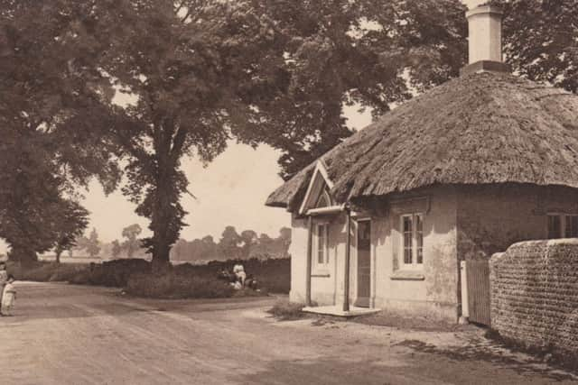
The old cottage that stood at the Goring crossroads


The more frequently photographed of the two was Offington Lodge, which stood just to the north-east of Broadwater Green.
This picturesque cottage – which will feature in the next article in this series – was seen by anyone travelling to or from Worthing on the London road.
Advertisement
Hide AdAdvertisement
Hide AdThe other cottage – the focus of the present article – stood at the western approach to Worthing.
This location is now the busy roundabout at the junction of the A2700 (Titnore Lane), the A2032 (to Worthing), and the A259 (from Littlehampton to Goring).
A hundred years ago the junction was known as Goring crossroads or Goring crossways.
This tiny cottage, which was once a tollhouse, was demolished in 1938. Today the place where it stood is under the tarmac of the roundabout.
Advertisement
Hide AdAdvertisement
Hide AdMost photographs of the scene suggest that the old tollhouse stood in total isolation, but the two cards at bottom right demonstrate that this familiar cottage was in fact one of a pair.
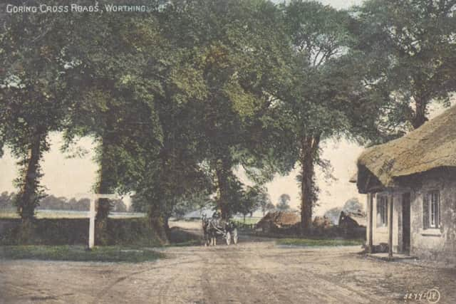
The photograph of this location that was most often used on postcards is the view looking north towards Titnore Lane with a horse and cart in the centre of the picture.
The large national firm of Valentine & Sons of Dundee printed many hundreds of copies of postcards using this photograph, and it also appears on a postcard published in John Davis’s Victoria Series.
Although one version has “Published exclusively by Walter Bros, Worthing” on the back, it was undoubtedly produced for Walter Bros by Valentine & Sons. In those days the concept of exclusivity was somewhat elastic.
Advertisement
Hide AdAdvertisement
Hide AdI have another version of this photograph, with different colour-tinting, where both firms are credited – the words “Published by Walter Bros, South St, Worthing” being immediately followed by “V. & S, Ltd”.
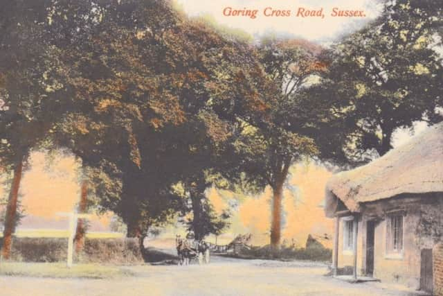
The colour-tinting of early postcards was done by artists or technicians who had never seen the location at question, and simply chose colours that seemed to them attractive or appropriate.
In the case of one of the cards, however, the colour used for the sky is far from appropriate since – while a western sky is often rosy or orange in the evening, and a sky to the east may be pink in the morning – it is a meteorological impossibility for there to be an orange-pink sky to the north, as here!
In the first two decades of the 20th century a number of different methods were used for tinting monochrome images to give a colour effect, and different publishers used different techniques.
Advertisement
Hide AdAdvertisement
Hide AdIt is clear that some of these techniques – including the one used by Valentine’s – meant that any given colour-tinted “plate” could be used for only one print-run.
Each time a card needed to be reprinted, therefore, a colour-tinter had to set to work again, generally using slightly – or, sometimes, dramatically – different colours from previous versions.
I have seen four different colour-tinted versions of the Valentine’s postcard at top left, and there is a card of Broadway Mansions (to the north of Steyne Gardens), published a century ago by Dennis & Sons, of which I have an incredible eight different colour versions.
The message on the card with no publisher given, which was sent on August 11, 1922 to E Newton Esq, begins, rather mysteriously: “Just a line to say I have arrived & am returning home tomorrow after sundry adventures. The weather has not been kind, but might have been worse.”
Advertisement
Hide AdAdvertisement
Hide AdThe card to its right was sent to Mr Gray of Camberwell on August 23, 1920, and the message read as follows:
“Dear Dad, The weather has not been so good. Rained all day today, so we are going to the pictures tonight. Walked along this road yesterday. It is a lovely walk. Hope you are all well. Tell Bob I am glad to hear of his luck. I hope something better will turn up. Love to all, Emily”